Single-Line vs Outline Fonts for Neon Signs
Real neon signs are bent from one glass tube, so the best-looking ones use letters that can be drawn in a single line. A printed channel with an LED strip lets you do both: follow a pen stroke like handwriting, or run the strip around the edge of bold letters. They look different, cost a different amount of strip and print differently. Here is how to choose.
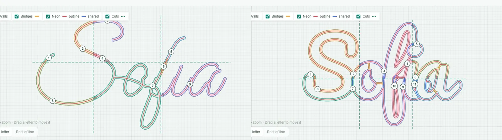
The two kinds of font
Single-line fonts
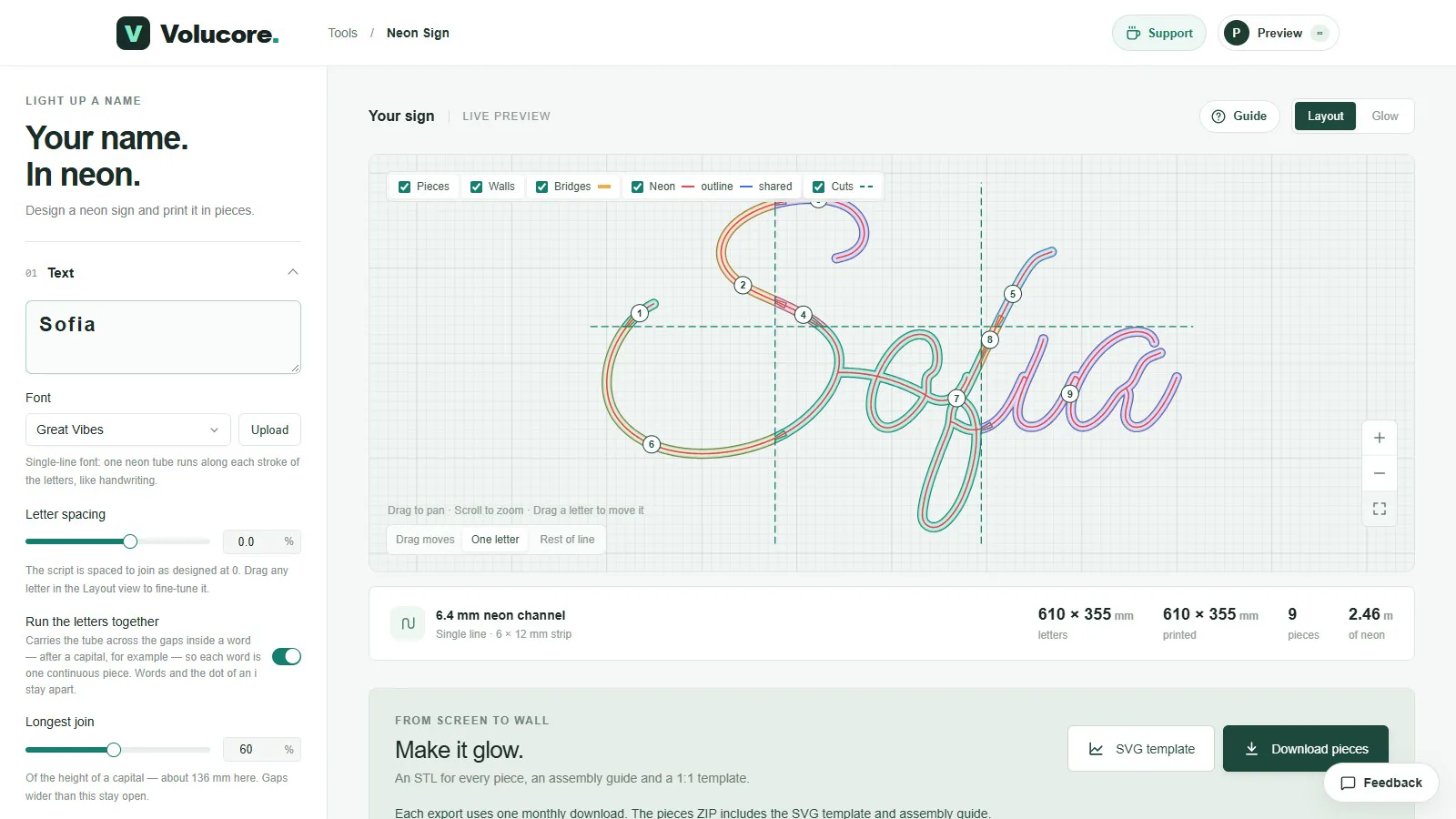
A single-line font is a thin script where each letter is one stroke, like writing with a pen. In the Neon Sign tool, one neon tube runs along each stroke. The tool includes six: Great Vibes, Formal Script, Brush Script, Playwrite CU, Playwrite BE WAL and Edu AU VIC WA NT. Because strokes are connected, the tool can run the letters together and carry the tube across the gaps inside a word, so a whole word becomes one continuous piece of strip. Words and the dot of an “i” stay apart.
Outline fonts
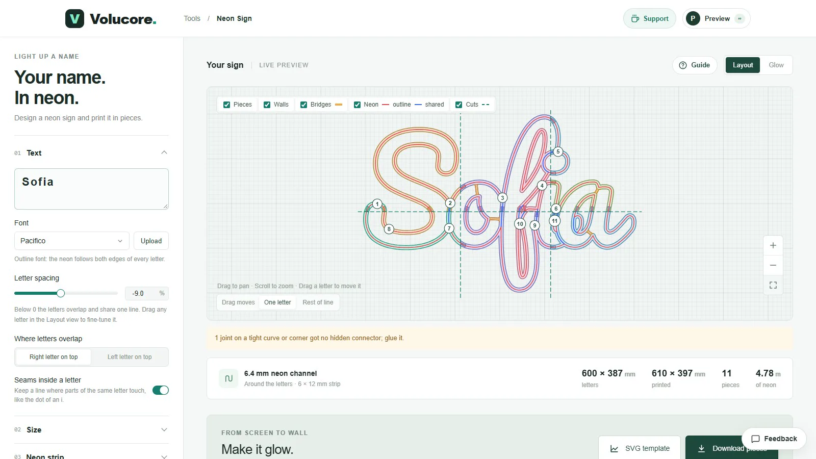
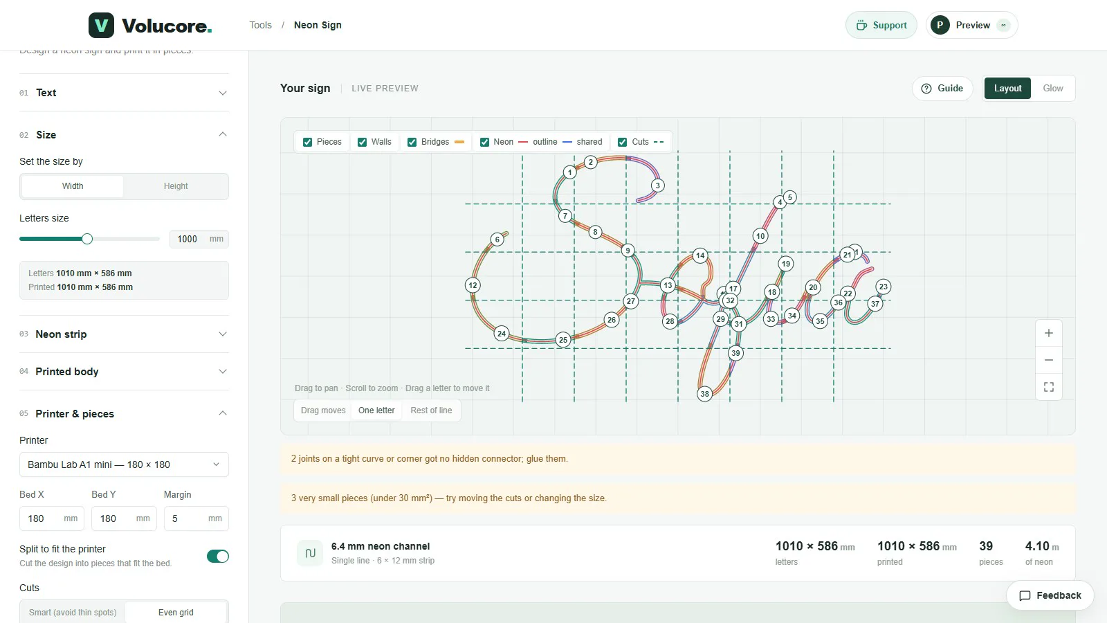
An outline font is a bold letterform, and the neon follows both edges of every letter, so each letter is drawn with two tubes. The tool has fifteen, including rounded and chunky faces like Chewy, Pacifico, Lobster, Titan One, Bungee and Righteous. Where outline letters overlap, they share a single line, drawn in blue in the layout view, so the overlapped part is not doubled.
How much strip each uses
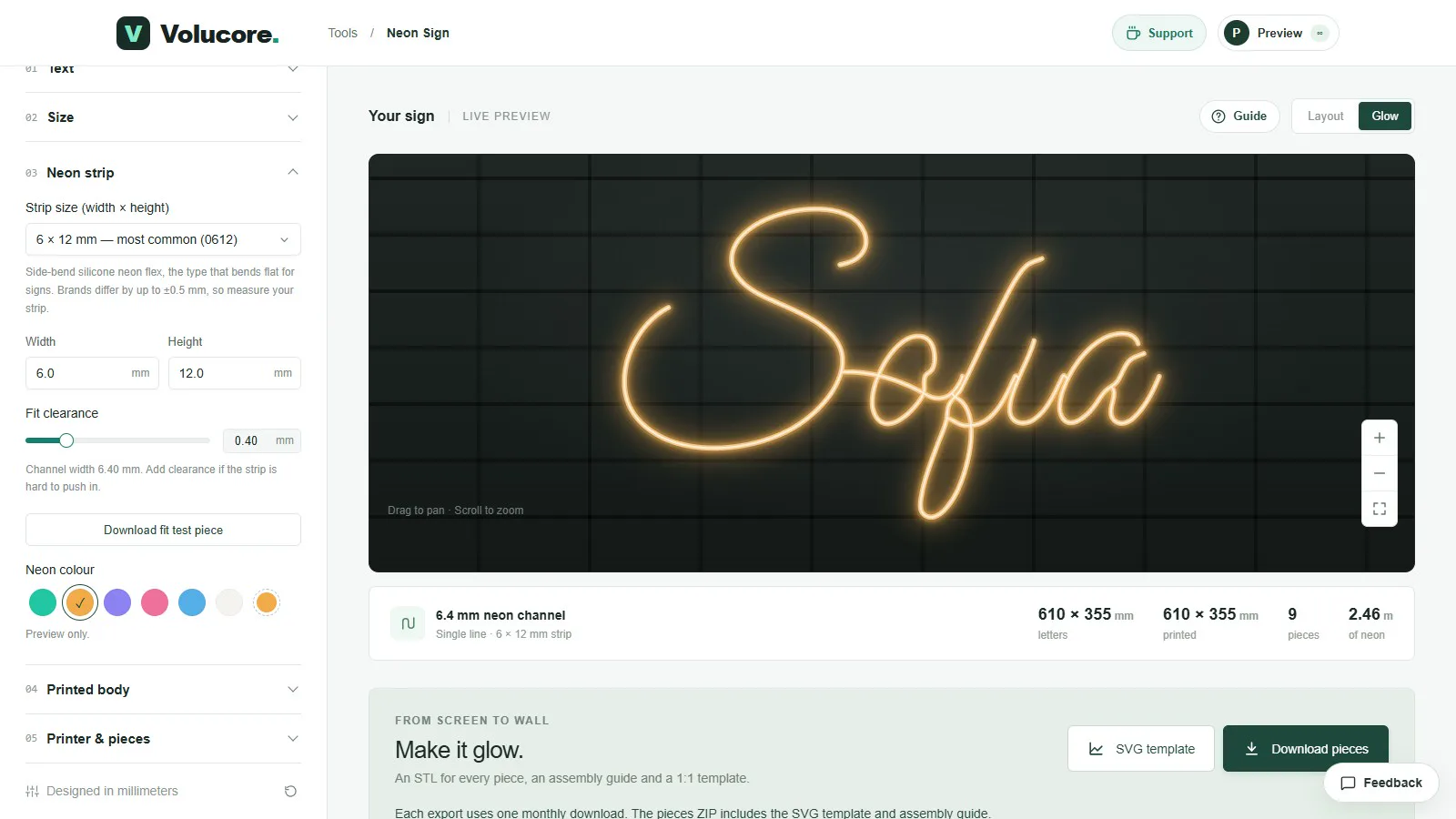
The length of neon is shown under the preview. Here is the same name, Sofia, at 600 mm letter width on a 256 mm bed, in five fonts, as the tool reports them:
| Font | Kind | Neon needed | Pieces |
|---|---|---|---|
| Great Vibes | Single-line | 2.46 m | 9 |
| Bungee | Outline (wide capitals) | 3.24 m | 3 |
| Chewy | Outline | 4.11 m | 10 |
| Lobster | Outline | 4.68 m | 13 |
| Pacifico | Outline | 4.78 m | 11 |
The single-line script needs about half the strip of the outline script fonts, because each outlined letter is traced twice. Outline fonts with wide, simple capitals, like Bungee, can need fewer pieces because the lettering is short and wide. If you are working to a budget, or buying a short length of strip, single-line fonts are the economical choice.
How the light looks
A single-line sign looks like classic neon lettering: thin, elegant, and best on names and short words in script. An outline sign reads as bold and graphic, with a double line that makes each letter look filled and glowing. Outline fonts are easier to read from far away and are good for short words, initials and logos.
Printing and assembly
| Single-line | Outline | |
|---|---|---|
| Strip used | Least | About twice or more |
| Channel complexity | One path, gentle curves | Two paths, tighter inner curves |
| Number of pieces | Fewer for the same size | More for the same size |
| Best for | Names in script, short phrases | Short words, initials, bold logos |
| Minimum size | Small loops need a narrow strip | Letters need room for two strips |
Spacing, overlap and moving letters
Both kinds of font have letter spacing controls. Outline fonts start with negative spacing so that neighbouring letters overlap and share a line; a single-line script is spaced to join as the font designer intended, at 0. You can also drag any letter in the layout view, set which letter lies on top where outline letters overlap, and use Reset moved letters if you want to start again.
Using your own font
You can upload a font file (for example a .ttf). It stays on your device; only the outlines needed for your design are sent when you download. A font made as an outline will behave like the outline fonts above. Fonts with very small details can be refused with a message, because a channel cannot reproduce detail finer than the strip itself.
A quick way to choose
- Start with the sign’s purpose: a name on a bedroom wall is usually single-line script; a shop word or an initial is often outline.
- Check your strip budget in the Glow and layout view, where the neon length is shown.
- Choose a size large enough that the smallest loop in the font is wider than your strip’s bend radius.
- Print the fit test piece so you know the strip works before you commit to the whole sign.
Questions people ask
Which font gives the most authentic neon look?
A single-line script. Real neon is bent from one tube, and a single-line font reproduces that with one continuous run of strip.
Why do outline fonts need more pieces?
More strip and a more complex path make a longer channel, and the longer the channel, the more cuts it needs to fit your printer bed.
Can I mix fonts in one sign?
The tool uses one font per sign. Use separate signs for different fonts, or use the multi-line text to stack several lines in the same font.
Keep reading
 How to Make a 3D-Printed LED Neon Sign: The Complete GuideStep by step: choose an LED neon strip, design the sign, split it into printable pieces, print, assemble, wire and mount it. With real numbers from a 610 × 355 mm example.
 LED Neon Strip Sizes and Fit for 3D-Printed SignsHow to measure an LED neon strip, why 6 × 12 mm is the common size, how fit clearance works, and how to avoid a channel that is too tight or too loose.
 How to Split a Large Neon Sign into Printable PiecesHow the Neon Sign tool cuts a big sign into numbered pieces that fit your printer bed: bed size, margin, smart or even cuts, hidden dovetail connectors and what to do about warnings.
Written and checked by the Volucore team against the behaviour of our tools. Spotted a mistake or something out of date? Tell us and we will fix it.