Back Plate, Solid Letters or Channel Only? Choosing the Body of a Neon Sign
The strip makes the light, but the printed body decides how the sign looks when it is off, how strong it is, how much filament it uses and how you hang it. The Neon Sign tool offers three body styles and a handful of dimensions. This guide explains each style, when to use it and what the numbers do.
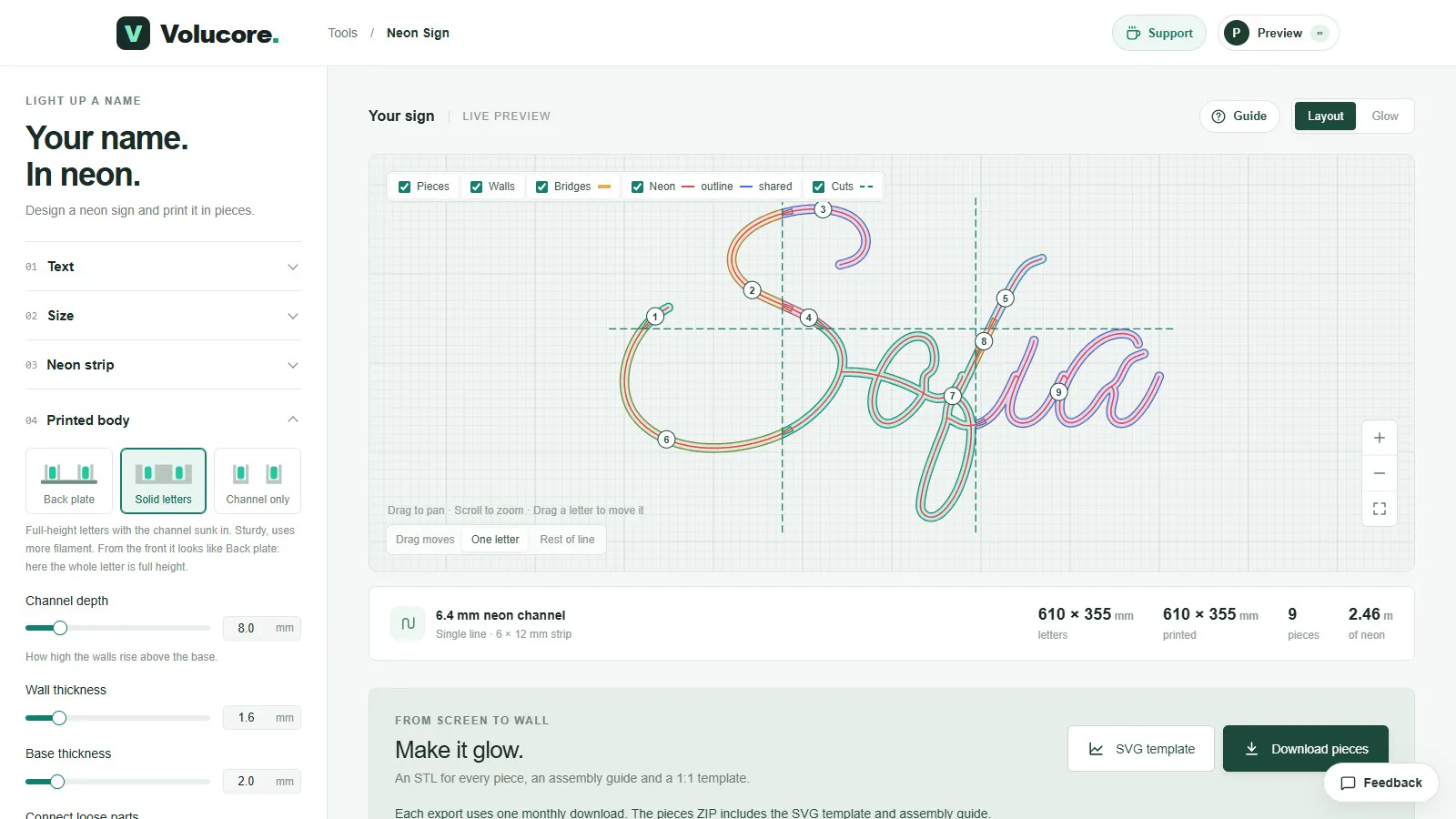
The three styles
Channel only (the default)
Just the U-shaped channel following the neon. There is no plate between letters, so the sign is the lightest and quickest to print, and uses the least filament. You mount it on clear acrylic or straight to a wall, which makes it look like a floating line of light. It is the right style for most script signs, and it is the default.
Back plate
A thin letter-shaped plate with walls that hold the neon. From the front, the plate sits between the walls, so the sign has a solid letter shape behind the glow. It is light and quick to print, and it can be hung by itself without a backing sheet, because the plate holds the shape together.
Solid letters
Full-height letters with the channel sunk in. The whole letter is a thick block, so it is the sturdiest and the heaviest, and it uses the most filament. From the front it looks like the back-plate style, but the letters are deeper and have more presence.
| Channel only | Back plate | Solid letters | |
|---|---|---|---|
| Filament | Least | Medium | Most |
| Strength | Needs a backing or wall | Self-supporting | Strongest |
| Look when off | A fine line of channel | A flat letter shape | A chunky letter block |
| Mounting | Clear acrylic or wall | Wall or hanging | Wall or standing |
| Best for | Script names, floating look | Bold signs without a backing | Shop letters, standing displays |
Channel depth
The channel depth is how high the walls rise, from 2 to 40 mm, and it defaults to 8 mm. The strip stands in the channel, so the depth decides how much of it is hidden. With the default 6 × 12 mm strip, 8 mm of wall hides two thirds of the strip and leaves the top third showing. Deeper walls hide more of the strip and give a more directional glow; shallower walls show more strip but hold it less firmly.
Wall and base thickness
- Wall thickness (0.8 to 6 mm, default 1.6 mm). Thick enough to stay rigid and hold the strip, thin enough to print quickly. 1.6 mm is four lines of a 0.4 mm nozzle.
- Base thickness (1 to 8 mm, default 2 mm). The floor of the channel. A thicker base is stiffer and holds the dovetail connectors better, but uses more filament.
Connecting loose parts: bridges
Script lettering has separate islands: the dot of an “i”, the centre of a letter, or letters that do not touch. In the Layout view, Connect loose parts adds slim bars with rounded joints that tie these islands to the body so the sign prints and hangs as a single piece. They carry no neon. You choose their width (2 to 20 mm, default 5 mm) and their height (1 to 40 mm, default 3 mm).
The bridge height is measured from the back of the sign, so low bars stay out of sight. At a height flat with the base they hide behind the glow; at full height they are visible from the front and strongest.
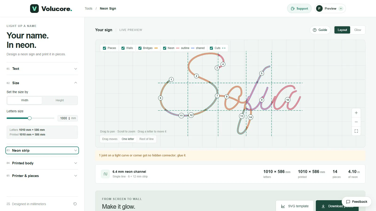
Design tips for each style
Channel only
- Add a clear acrylic backing so the sign holds its shape.
- Keep the bridges low, flat with the base, so they hide behind the glow.
- Print the fit test piece; the channel is the only structure.
Back plate
- Keep the plate thin; a thicker plate adds weight and filament with little benefit beyond stiffness.
- Turn on extra plate dovetails for a large sign that will hang by itself.
Solid letters
- Expect long print times and plan your filament; deeper letters use much more.
- Use lighter infill; the walls carry the load.
- A lower channel depth is fine if the sign will be viewed from the front only.
Strength and weight
Strength comes from the walls and the base, not from infill. A channel-only sign has thin walls and a thin base, so it is flexible; a back plate is stiffer in the plane of the sign; solid letters are rigid. For a sign that will hang by itself, choose back plate or solid letters. For a sign mounted on acrylic or a wall, channel only is enough.
Common mistakes
- Choosing solid letters for a large sign and finding that it takes days to print.
- Using a very deep channel with a narrow strip, which hides too much of the glow.
- Making the walls very thin to save filament; they flex and the strip pops out.
- Turning off the bridges on a script font, which leaves loose parts that you must glue on by hand.
How to choose
- If you have a clear acrylic sheet or will mount on a wall, choose Channel only.
- If you want the sign to hang by itself, choose Back plate.
- If it will stand on a counter or needs to survive handling, choose Solid letters.
- Whatever you choose, print a short piece first with the fit test.
Questions people ask
Which style prints fastest?
Channel only, because it has the least material. Back plate is next, and Solid letters is slowest.
Do the three styles look different when lit?
The glow is the same, because it comes from the strip. The difference is what you see around it when the sign is off and from the side.
Can I change style after I have printed a test?
Yes. The style is a setting in the tool; change it, check the preview and download new pieces.
Keep reading
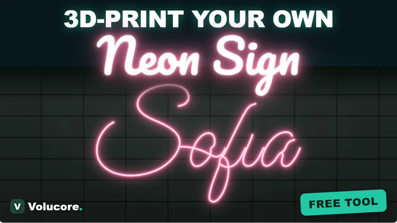 How to Make a 3D-Printed LED Neon Sign: The Complete GuideStep by step: choose an LED neon strip, design the sign, split it into printable pieces, print, assemble, wire and mount it. With real numbers from a 610 × 355 mm example.
 Mounting and Finishing a 3D-Printed Neon SignWays to mount a printed neon sign (clear acrylic, standoffs, tape, hanging), how to paint or sand the channel for a brighter glow, and how to hide the cable.
 3D Print Settings for Neon Sign Channels: Material, Walls and FitStarting settings for printing LED neon sign channels: filament choice, layer height, walls, infill, orientation, brims and how to tune the fit of the strip and the dovetails.
Written and checked by the Volucore team against the behaviour of our tools. Spotted a mistake or something out of date? Tell us and we will fix it.